Sunday 31 December 2017

Happy New Year! - Here Comes Spring!


Happy New Year!


I would  like today, to wish a  very happy, healthy and abundant New Year to all of my students, followers, and fellow artists.  Let us all paint the world happy in 2018! 

Many Blessings,

Kate 

Saturday 30 December 2017

A Solent Sunset - Painting Process

A Solent Sunset © Kate Lomax 2017
As artist, we all get days when we have the urge to splish splash a little more freely than normal, and are not sure what to do with all of that creative energy.  
A very long time ago indeed, probably years, I decided that on those days, I would create backgrounds.  Not for anything in particular, just for stock.  So, tucked away, I have a number of ready to go backgrounds.  This cotton canvas on board, has been tucked away as a, 'ready to go', background.  Here it is, as it was when I fished it out of my stock drawer.

Background

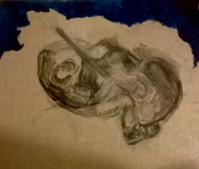
Knowing that I had planned to paint a sunset, this was perfect.  I then focussed on my composition by using a grey charcoal to map it all out

Stage 1 - Composition

Making the best use of the colours on the canvas, I outlined what will be the Isle Of Wight in the distance, the ocean, the mid field waves, the near field waves and the foreshore.

Stage 2 - Palette

Stage 3 - Dropping In The Shadows

It is always vital to drop in the shadows before you get started.  Trying to paint them in after is a nightmare, and they wont look natural.  Put them in first, using a contrasting colour.  My choice was Red Oxide - Mussini. 

Stage 4 - Colour Map

Yep, at this stage it looks like you really cant make up your mind what colour to use.  Once they were on there, I blended with the softest brush I have, to make sure I keep the colour signatures.  Harsh brushes create mud! I created the purple from my palette.

Stage 5 - Start Blending - Add Waves

Adding waves is a joy for me.  I watch the sea quite a bit, even video it from time to time to study the wave patterns.  In the Solent we have a flow of water from Southampton end, and another from Portsmouth end, which come together in Lee On Solent, in the form of a cross current. Quite fascinating to watch.

Stage 6 - Keep Blending, Add More Waves

It is essential when you are painting water, that you capture movement, and the easiest way to illustrate movement is by creating waves.  Thankfully, in my neck of the woods, because of the cross current, the waves are plentiful.  They dance along the shore like a chorus line, taking turns to can - can with their frilly frocks along the beach.  With each wave comes the underwave spill, the water that collects in a pool along the shore.  This is when you are so grateful for the shadow you dropped in earlier!!  

A Reminder - The Shadow

Stage 7 - Final Touches

Finally, I have added my highlights, my white horses on the ocean, defined the Isle Of Wight In the distance, and added lights in the sky using additionally, Lemon Yellow & Alizarin Crimson.  I have used Mussini's indispensable transparent black, Asphaltlasurton on the foreshore.

I am so lucky to live right on the Solent.   The Solent is a channel between the mainland and the Isle Of Wight, which was also the resting place of The Mary Rose, until her discovery in the depths of the water just to the east of Lee On Solent. With Southampton Docks to the west, and Portsmouth Docks to the east, the Solent is a busy shipping channel.  The current swirls from Southampton end and Portsmouth end, so on a rough day, it can be extremely choppy.  On a good day you get the cross current forming all sorts of waves and surf.  In 2006/7, after a life change, I photographed the dusk,  every single day, to give myself something to look forward to.  The sunsets in the summer are stunning. However, in the winter, with the sun low in the sky from midday onward, on a clear day, it is a sight to behold.  Purples, reds, oranges, and yellows dance around the sky, and as the sun disappears beneath the horizon, she gives a final kiss to the ocean and everything that surrounds it.   

Do try a waterscape yourself.  It isn't that scary, as long as you do the shadows first!

If you find these tutorials helpful, please feel free to share on your art pages, and perhaps leave a comment.   Perhaps also subscribe to my blog so you are notified when I publish a fresh one! Just click the 'Subscribe' button in the right hand column.  Thank you.

Have fun! 

A Solent Sunset & Tutorial © Kate Lomax 2017 All Rights Reserved


Ted & Golly


After several decades painting .... 

One builds up a stock of photographs, gazillions probably..  I carry at least two cameras with me at all times, three if I count my mobile...   You also build up a stock of bric a brac, objects d'art, all manner of 'things' - buttons, beads, ribbons, cotton, tins, anything that delights the eye, the curiosity, and kick starts the creative juices.

Then there is your personal stuff.

I for one, overlook my personal stuff.  Well, it's personal isn't it?  Did I really want to share the remains of Old Ted, long tired out and worn out, yet still up for a cuddle without falling apart, then poor Golly, always smiling, bright and shiny whatever the weather.  Even if the dog did swing him around by his legs ....  Still smiling.  Now I adore smiley folk, so I wouldn't want to be doing anything to upset Golly. Or Old Ted. Especially Old Ted in fact.  He's eons older than me, and at 61 years 11 months and 28 days, I am cantankerous enough when taken for granted.

So, it was a big decision. 

I wanted to illustrate them as the inseparable friends they are.  Always together, perched in the old fireplace I converted into bookshelves. Old Ted giving 
 that unimpressed sideways glance, almost as if he is just tolerating Golly's young whippersnapper ways.  Old Ted's faded, twisted and a little bit dishevelled ribbon being shown off like a war medal.  It is the original bow tied into the ribbon. I have never been able to figure why it is so loose. It just is, always has been.  Old Ted has posable arms and legs, held together throughout by tiny little hand stitches.  The pads on his hands and feet attached in the same way.  His eyes are made up of a number of French knots, and his funny little expression made up from more hand stitching.

Golly, on the other hand, has more of a modern feel about him.  Machine stitched, he is now going a little grey and fading, but his smile goes on and on.  How can you be having a bad day when you have Golly to share it with?  

So, on the day, when even a gazillion photographs were not enough, when the bric a brac was uninviting clutter, the buttons seemed boring , the beads fiddly, the ribbons bland, there, in a flash, were Old Ted & Golly.  

My old friends and I spent a glorious few hours chittering while I painted away, determined to capture Old Ted's very strange ageing fur, and Golly's over stuffed stiffness and ridiculously large bow tie.

Sometimes, it is the things we take for granted that we need to get to know again, isn't it?

Ted & Golly © Kate Lomax 2017 All Rights Reserved

Thursday 28 December 2017

The Lemon Tree - The Painting Process

The Lemon Tree © Kate Lomax 2017
Oil On Linen Board.  All Rights Reserved

My first job was to decide which part of the tree to paint.  I didn't wish to capture the whole plant, as the lemons would have been tiny and looked quite irrelevant against the plant's bushy foliage.  So I mentally zoomed in on an area that seemed quite abundant, not only in foliage at all stages of growth,  but in fruit and flowers also.
I selected my two base colours thus: 

Mussini Translucent Yellow & W&N Turquoise
I then set about using charcoal to sketch my composition, to make sure my thoughts on the plant were going to work, eye appeal wise.  Once happy, I applied a wash of Turquoise to set the charcoal.

The composition begins with the leaf in the top left corner, moves across
to the lemon pointing down to direct the eye down, to swing
across to the largest leaf in the bottom left corner, inviting
the viewer to  a complete tour of the canvas.
Happy with my sketch and undercoat, I moved on to my first stage of colour, which is, at this stage, very elementary.  I don't want to complicate the process by applying too much paint.  Keep it fine and build wet into wet as the Alla Prima technique demands.  Too thicker paint will create stress should you need to move the paint for fine adjustments.  

First Stage Colour
I used the Translucent Yellow to mark out the leaves and lemons.  Note, where the Turquoise and T. Yellow have merged a gorgeous light leaf green has been created.  This can be deepened with more blue, or lightened with more yellow. Look at the image, Second Stage Colour (below) You can see where I have deepened and lightened the colour.  At this stage I wanted to see how many greens I could create using my two colours plus Mussini Titanium White.

Second Stage Colour
Third Stage Colour
Third stage colour involves creating a depth of field with the colours you are using.  Remember colours become clearer and deeper as the object nears the front of the viewing field.  I also dropped in the positioning of the white lemon blossom here, and first stage highlighted some of the leaves and the lemons.

Fourth Stage Colour
Fourth stage colour is really pulling together your hues and tones to create a dance between the colours.  I call it 'the zing'.  Deep in the plant there are leaves which are quite dark, that would have dumbed down the painting, so, using artistic licence, I lifted them a little.The larger, more mature leaves on the left have ridges, the younger leaves have not necessarily developed these yet and are very similar to bay leaves in their early life.  In the part of the paint, I added detail such as stamen, buds, veins, lemon skin irregularities, such as dimples.

Fifth (final) Stage
In this final stage of painting, I added the tiny bud casing, the stamen on all of the blooms, the viens on the leaves,   and, mindful of the light and shadow values, I had kept the plant on a side table next to my easel the whole time.  Lacking now in daylight, I turned my daylight lamp on and placed it where the sun would be in relation to the tree.  I then made my final light corrections, prior to working on the green bark of the tree.  I used a tiny speck of Ultramarine Blue on the darker leaves, and to enhance shadow.  Lemon Yellow on the highlights of the leaves completed the paint.

The Lemon Tree plus Tutorial. © Kate Lomax 2017. All Rights Reserved.

💚 Please Share My Tutorial Among Your Art Communities

Beach Busker - The Painting Process


Beach Busker © Kate Lomax 2017
Alla Prima - Oil on linen board

I loved painting this picture. I originally took the photograph of this double bass player, probably around 2000, in Hampshire. He was part of a quartet who were playing to entertain holidaymakers. I didn't want to be in his face taking pictures, so I found a vantage point directly above him, promising myself to paint it very soon after.  Ahem! Seventeen years or so on....
Alla Prima lends itself to water so well, allowing your brush to flow with the tide, swirling and rolling with the water, to me is one of life's joys.  Load your brush up with several colours, then roll your brush along the shore - remember to drop a shadow underneath the waterline first, because it is a devil to pop in after.....

Here is how 'Beach Busker' came to be

Stage 1 - Charcoal Sketch

Firstly, to decide on my composition, I sketched with charcoal the busker, adding very roughly, the shoreline in Prussian Blue, which became my shore and wave shadow as the work progressed. 
Stage 2 

The next two steps were to apply a colour map. Yellow Ochre was daubed roughly where the sand might be. French Ultramarine and Mussini's Titanium White were applied together and applied with a rolling brush. At this point, if I wasn't happy I could wipe it all off and start afresh, - one of the benefits in painting Alla Prima, win win  all around!   
 The darker tones were then applied to the Yellow Ochre, by introducing  in a touch of Mussini Indian Red. Do not overwork it, or it wont look like sand for very long!

Stage 3

For my own reassurance, I needed to work on the ocean and beach before proceeding to the figure, although I did map the busker out in colour tones to get an idea of the 'zing' factor.   I decided that applying Windsor & Newton's Turquoise to the ocean would zing with the reddy tones of the double bass, rather than use a cobalt or ultramarine which I felt would dumb down the zing factor.
Stage 4

The busker was relatively easy to complete, paying attention to details like his shoes, the shadow from his trouser leg on to his sock, the creases in his trousers. More Indian red was added into the sand where it might be wet.  Highlights were applied to the sand also, to lift the colour.  Highlights were then applied to the double bass, shirt and to the top of his balding head.  Almost Done!
Stage 5

The final stage is adding fine detail, almost invisible to the casual viewer, however easily spotted to the trained eye or art critic. The left hand under wave has a new edge on it which is a more natural shape, the sand has highlights, as if it is glistening in the sun.  The double bass now has it's fiddle thing holder.  I polished his shoes while I was there,  Worked on his flesh tones, arms and fingers,  and gave the double bass it's highly polished look with some subtle highlights.  I also disturbed the sand around the double bass to show where it had sunk into the sand.   The very last thing I added was his cap, placed to accept generous donations from the public. 
Beach Busker &  Instructional Blog © Kate Lomax 2017 - All Rights Reserved

Wednesday 27 December 2017

Exciting News! Live Again!!

Hi, I am happy to announce that this blog is now live again.  Yay!  This will be linked to my website, and also to my Daily Painting profile.  More details tomorrow!